• Hello guest! Are you a Bearded Dragon enthusiast? If so we invite you to join our community and see what it has to offer. Our site is specifically designed for you and it's a great place for Beardie enthusiasts to meet online. Once you join you'll be able to post messages, upload pictures of your dragons and enclosures and have a great time with other Bearded Dragon enthusiasts. Sign up today!

Which Do You Like Better???

Which Website Look Do You Prefer?

  • "Old Look" - Sky Background - Blue

    Votes: 0 0.0%
  • "New Look" - Dragon Background - Brown

    Votes: 3 100.0%

  • Total voters
    3
  • Poll closed .

Germ

Bearded Dragon Veteran
3 Year Member
1,000+ Post Club
Messages
4,493
Location
North America
I started out making a few slight changes, then got really carried away :eek:. Now I can't really decide which I like better. :(

The Old Look' is nice and clean. shown here ...
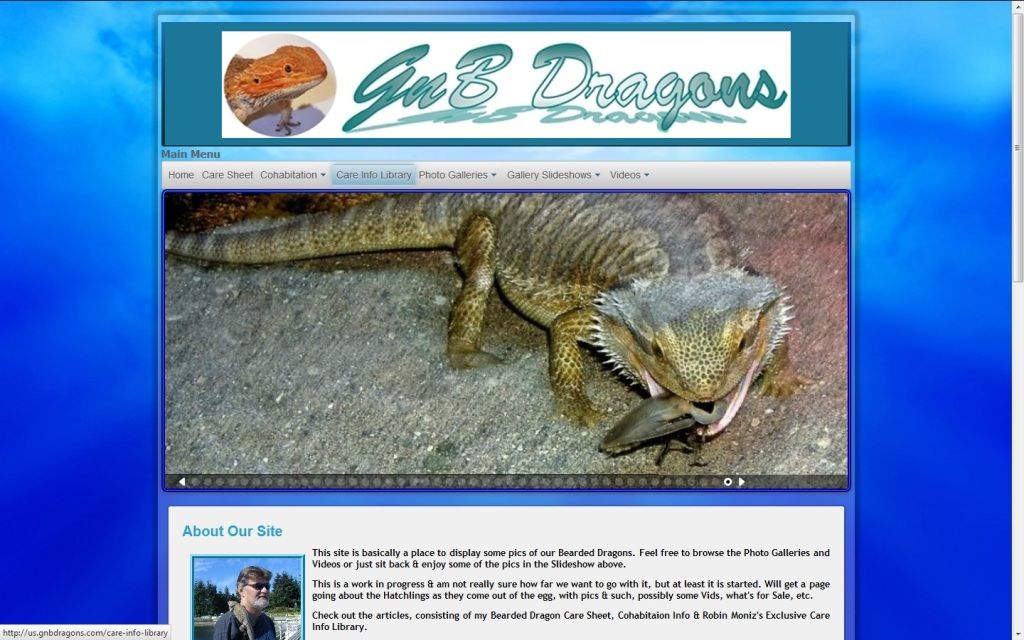


The 'New Look' is a little 'Busy', but I do like it & it is one of a kind, have never seen one quite like it, shown here ... (Clicking on either Picture will take you to the sites live.)
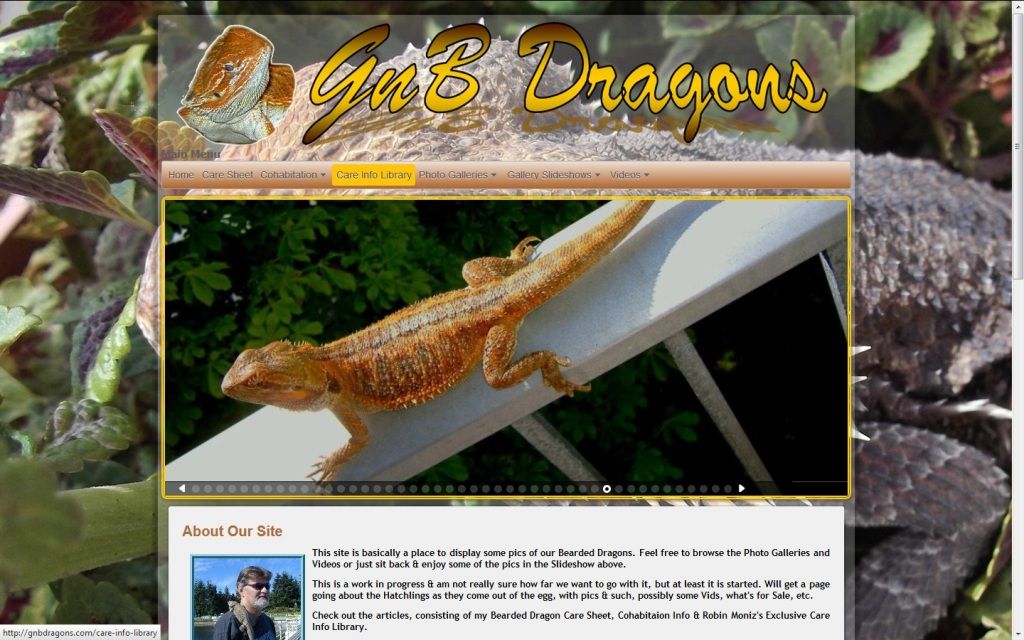


Give me a hand in choosing & take a second to have a peek & cast your choice in the Poll, please.

Thanks in advance,
 

Aleena

Bearded Dragon Veteran
1,000+ Post Club
Messages
1,996
Location
Utah
I can't vote. I like parts of 1 better, but parts of 2 better. I like the blue background, it's rich. The leaves in the second one are kinda clashy. I like the green and white and orange in the second photo though.
 

Germ

Bearded Dragon Veteran
3 Year Member
1,000+ Post Club
Messages
4,493
Location
North America
Yes, I agree about the Clashy, that's what I meant by 'Busy'. The pic itself does doesn't do it justice unless you go right to the site to appreciate the transparent scrolling foreground, which is on both, but much more noticeable on the new one. I used that Background because it is such a good HI-Res pic of the Dragon, but agree that all the leaves may be a bit much. I'm liking the transparent banner, also.
 

Aleena

Bearded Dragon Veteran
1,000+ Post Club
Messages
1,996
Location
Utah
Okay, now that is awesome. I should have went to the site instead of going off of what I was seeing here. The leaves don't really look like they clash when you take into account the transparency of the banner and empty spaces, it looks pretty cool.
 

Kodieh

Hatchling Dragon
Messages
31
I think the second one is very busy like you said, but my own style choices are against the whole "website above a background image". I like simplicity, though, so there are some style choices I would make like an integrated interface into a solid background.


Browsing on Tapatalk from my iPhone :)
 

Germ

Bearded Dragon Veteran
3 Year Member
1,000+ Post Club
Messages
4,493
Location
North America
As soon as I saw the opportunity & figured out how to go with the stationary background & the scrolling site, I went for it. It's different ... I am much like you about the simplicity, which I think I achieved with the first design. If it was a business, organizational or otherwise serious website, I would definitely go with a stationary, more solid simple colors & layout. I mean this one is pretty simple as far as content goes.

But it is my personal site, not trying to sell or promote anything, basically just a place to post my Pics & vids, post some good info, etc. At times I get tired of the bland websites, and thought I'd dress it up & for this type of personal site, the more I look at the new one, the more I like it. I've never built a website before, helped Jeff - http://draconicbloodlinez.com - get his up & running, a nice simple laid back format, then decided to give my own a go. Have enjoyed spending the time figuring out the codes & how to change things to my liking, be a little creative. I'm no computer geek, have had no training, but have been playing with them long before Windows, since the DOS days. This reminds me of that, where everything is not done for you by a program, that I actually have to dig into the Scripts to find out what does what & make the changes myself. Kind of a hobby, a learning process. If it gets tastefully gaudy, oh well ;).

I appreciate your insightful input. Thanks.
 

Pat B

Super Moderator
Messages
1,469
Location
Columbia SC
I would do whatever I like. Like you said....it is your personal site....I like the dragon background because it is different and not a 'drab' ordinary solid color like the blue....:rolleyes:
 

Kodieh

Hatchling Dragon
Messages
31
I understand what you mean. I just started teaching myself HTML, Javascript, and a dabble in PHP after I began my CS degree. Just a little robust'ing around the edges of my resume with programming languages. I haven't bought a domain or hosting for it, yet but all the files are there for when I do. I just go around and look for samples of Javascript/PHP that look interesting or I think I can apply to my designs, and play with the code. ;)
 

Em Lynch

Juvenile Dragon
Messages
347
Location
Gunnislake, Cornwall, G.B
I study graphic design and have designed a fare few websites in my time! i would have to say that the second one is a bit busy and i would never suggest using a full opacity image as a background as it looks quite cluttered and not as easy to navigate, lots of professional web designers use colour schemes selected from images and make a palette to use around the site to make it consistent and clean, even lowering the opacity of the background image would greatly improve the overall look :) normally gradient word-art style titles look tacky with a drop shadow but you've handled the design quite nicely so i wouldn't complain! heres a website i designed a while back with the help of wix -
http://www.wix.com/emilynch/beardie-behaviour#!home/mainPage

not a lot of the coding was done by me but it was only for a week project we had in college so this was acceptable - note the clean, easy to navigate design with use of a colour scheme i also made the site header myself in photoshop! hope that helps :D
 

Germ

Bearded Dragon Veteran
3 Year Member
1,000+ Post Club
Messages
4,493
Location
North America
Thanks for the input Em. Once again for the type of site that it is, I don't really mind 'Busy'. Lowering the opacity of the background is not an option for me, as the whole point of having it there was the quality Hi-Res pic that it is, that is already dummed down by the opaque foreground. To me dumming it down would take away from it. It is more to load though. As I mentioned earlier I went for the transparent look & wanted to incorporate it into the header also. A Transparent foreground is quite useless without an interesting quality background. I checked it out last night with a different background that wasn't quite so colorful, didn't work for me. I think it will stay as the new 'Look'. After all, it's my party ;).

Your site design is cool, I liked the content, although it is very much of a Boring look, No 'Bling' at all, not for me. I also made my own transparent Banners with my own pics, in the new one I made the Module headers & body backgrounds, will soon be incorporating the same header into the Menu itself, having a little trouble figuring the proper coding for it, but I'll figure it out. I also made the Draconic Bloodlinez Banner & put together all of Jeff's website, etc.
 

Germ

Bearded Dragon Veteran
3 Year Member
1,000+ Post Club
Messages
4,493
Location
North America
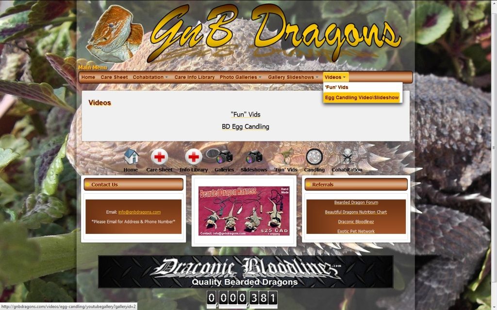
Got the coding sorted out for the menu to make it use the header block I created. Here is a pic that shows the majority of the module types. Done deal, this is how it will stay. Clicking on my signature will take you to the website itself.


Vincent

Hatchling Dragon
Messages
160
i love ur work..............nice job of warning people about what subtrate on not to use.got to give u a great thumbs up on that one germ.:p

1st one way better
 

redsided

Bearded Dragon Egg
Messages
11
I like the 2nd one, it's not too busy.. but maybe change/shift the background picture would help complete it
 
Top